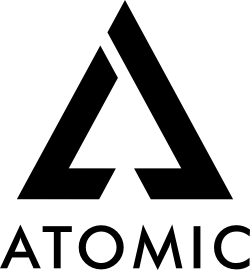
Brand kit

Use the marks well.
Keep them recognizable.

Logos, colors, and typography for press, partners, and integrations. Don't modify the marks; pick the variant that fits your background.

01 · Logos

Three lockups.
Black or white.

3 lockups·2 colors·PNG + EPS
Atomic Wordmark on dark
Wordmark
on dark
Atomic Wordmark on light
Wordmark
on light
Atomic Stacked on dark
Stacked
on dark
Atomic Stacked on light
Stacked
on light
Atomic Icon on dark
Icon
on dark
Atomic Icon on light
Icon
on light
02 · Colors

One accent.
A neutral spine.

1 accent·6 neutrals·AA contrast
Accent
--accent
#B8FF5C
Primary CTA, highlights, links
Ink
--accent-ink
#0A0B0C
Type on accent surfaces
Background
--bg
#0A0B0C
Page surface
Surface
--bg-1
#111316
Cards, sections
Surface 2
--bg-2
#16191D
Inset, controls
Foreground
--fg
#E8EAED
Body & headings
Foreground 2
--fg-2
#B4B8BD
Secondary text
Muted
--muted
#7A8089
Labels, captions
03 · Typography

Three families.
One voice.

Inter Tight·Inter·JetBrains Mono
Display
Inter Tight
500 / 600
Section heads, hero, h1–h3
Trade with leverage.
Body
Inter
400 / 500
Paragraphs, UI labels
Non-custodial leveraged trading on Arbitrum. No deposits, no KYC.
Mono
JetBrains Mono
400 / 500
Numbers, eyebrows, code
$105K · 25% APY · 0x4f2a…1c8b
04 · Usage

Do, and
don't.

Clear space = mark height·32px min
Do
  • Use the white mark on dark backgrounds (≥ #16191D).
  • Use the black mark on light or branded surfaces.
  • Keep clear space equal to the mark's height on every side.
  • Render at 32px minimum height for the wordmark.
Don't
  • Recolor the mark or the wordmark.
  • Stretch, skew, rotate, or outline the artwork.
  • Place the mark on a low-contrast or busy photographic background.
  • Recreate the wordmark in a different typeface.

Need something else?
We'll send the source files.

For press, listings, and co-marketing — reach out and we'll get you what you need.

bd@atomic.greenAll contacts